How to Add Drop Shadow in Canva (Fast & Easy Guide for 2026)
Have you ever tried to add a shadow to your words or pictures in Canva and got totally lost?
It is so annoying to click random menus and get stuck with a flat layout that looks kind of lifeless. Your design might already have a great setup, but it still feels like something is missing.
The good news is that a simple drop shadow is a total game-changer. It instantly makes simple graphics look like a real professional designer made them. You do not need crazy skills to make your work look polished. In this quick guide, you will learn the shortcut to adding shadows in Canva, how to fix tricky problems, and how to get beautiful results easily.
Quick Answer
To add drop shadow in Canva, select your text, image, or element, then open Effects or Edit Image, choose Shadow, and adjust the blur, offset, transparency, angle, and color. This is the fastest way to create standout text, realistic product shadows, and more professional graphics.
If you want to improve your Canva designs beyond shadows, these related guides can help you work with text, images, fonts, and other useful Canva effects:
- How to Outline Text in Canva
- How to Remove Background in Canva (Fast & Easy Guide for 2026)
- Best Canva Font Pairings (Free Combinations That Actually Work)
- How to Curve Text in Canva (Fast & Easy Guide for 2026)
Best Ways to Add Drop Shadow in Canva
| Method | Best For | Difficulty | Why It Works |
| Text Shadow | Headlines | Easy | Improves readability fast |
| Image Shadow | Product Photos | Easy | Adds depth and realism |
| Shape Shadow | Graphics | Easy | Makes elements stand out |
| Soft Shadow | Minimal Designs | Easy | Clean professional style |
| Strong Shadow | Thumbnails | Easy | High visual impact |
How to Add Drop Shadow to Text in Canva
This is one of the most useful Canva effects.
Step 1: Open Your Design
Create a new design or open an existing project.
Step 2: Add Text
Insert a heading or text box.
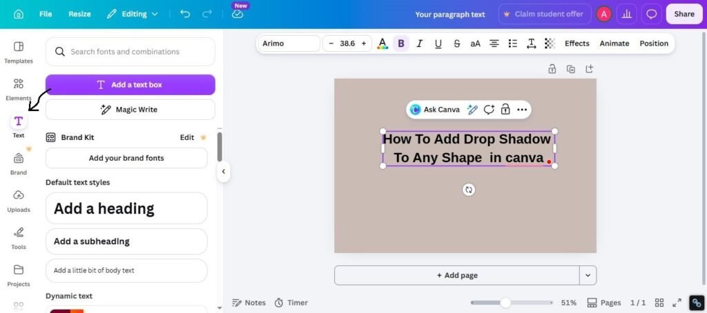
Step 3: Select the Text
Click directly on the text.
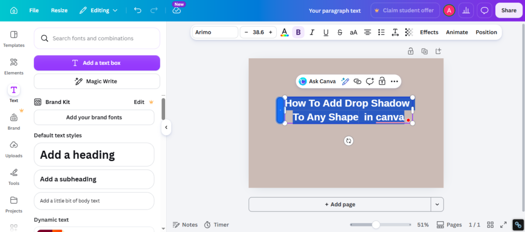
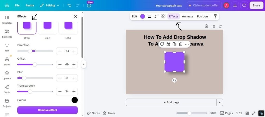
At the top toolbar, click Effects.
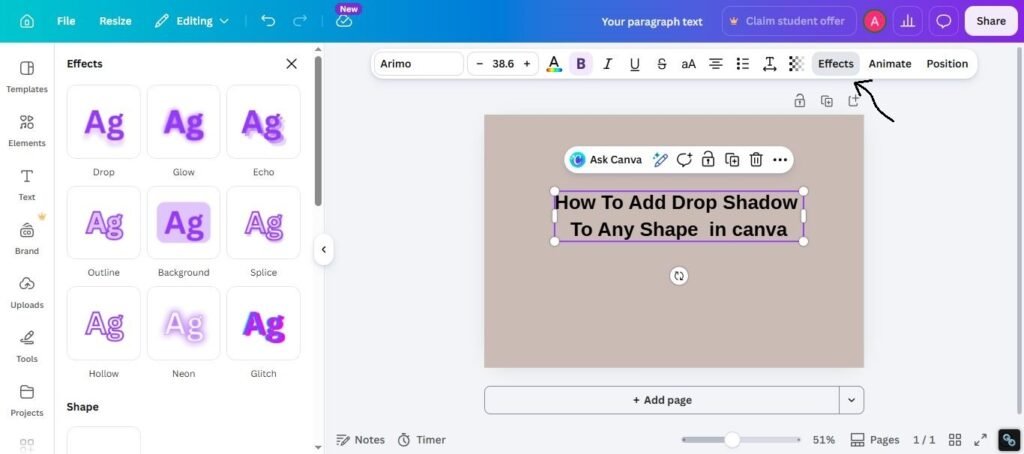
Step 5: Choose Shadow
Select the drop shadow option available in your Effects.
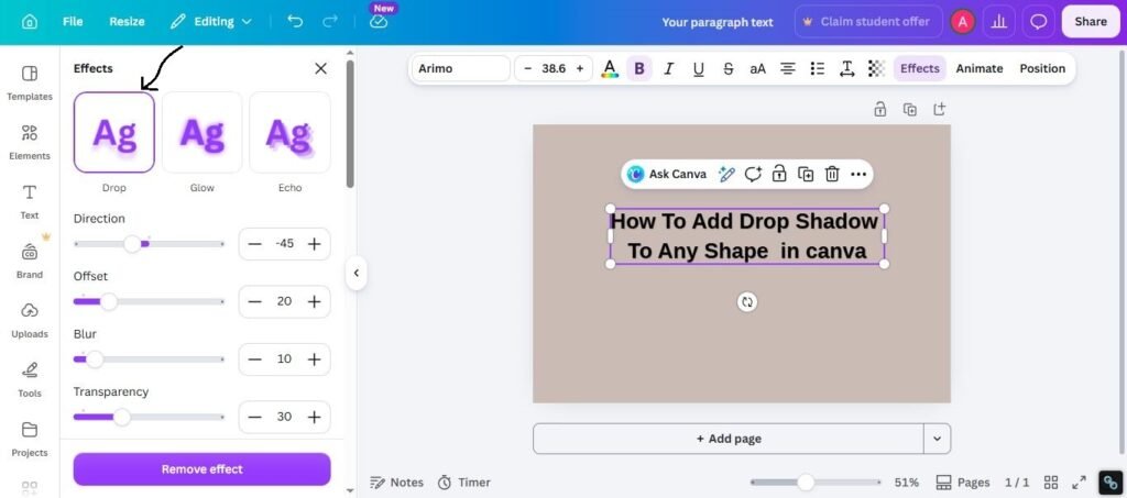
Step 6: Adjust Settings
Change:
- Shadow color
- Blur
- Distance
- Direction
- Transparency
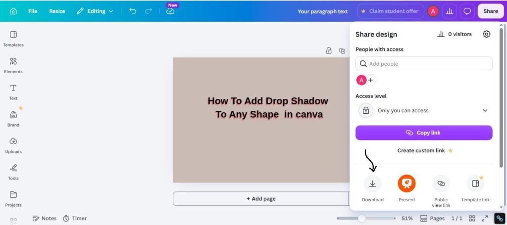
Step 7: Finish
Once the text looks clean, download your design.
How to Add Drop Shadow to Images in Canva
This works well for product images and mockups.
Steps:
- Select image
- Click Edit Image
- Find shadow tools
- Apply shadow
- Adjust softness and position
- Save design
This helps products look less flat.
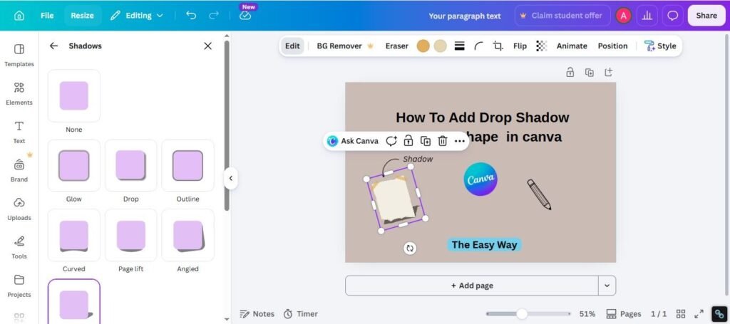
How to Add Shadow to Shapes and Elements
You can also shadow icons, shapes, stickers, and graphics.
Best for:
- Social media posts
- Infographics
- CTA buttons
- Banners
- Presentations
Use lighter shadows for cleaner designs.
Best Drop Shadow Settings by Use Case
For Text on Busy Backgrounds
- Dark shadow
- Medium blur
- Short distance
- Low transparency
For Product Photos
- Soft shadow
- Light blur
- Natural angle
- Medium transparency
For Thumbnails
- Strong shadow
- Bold font
- High contrast
- Short headline text
For Minimal Designs
- Very soft shadow
- Low opacity
- Small distance
Best Fonts for Shadow Text in Canva
Bold fonts usually work better with shadows.
Best picks:
- Anton
- Bebas Neue
- League Spartan
- Archivo Black
- Oswald
- Bungee
- Teko
Thin script fonts can look messy with heavy shadows.
Common Problems and Fixes
Shadow Option Missing
Try:
- Update Canva
- Refresh browser
- Select the item first
- Check different menus
Shadow Looks Too Harsh
Try:
- Increase blur
- Reduce opacity
- Shorten distance
Text Looks Dirty
Try:
- Use less shadow
- Use bolder font
- Improve contrast
Product Shadow Looks Fake
Try:
- Softer edges
- Smaller offset
- Lower opacity
- Better direction angle
How to Make Shadows Look Better
Use these practical tips:
1. Keep It Subtle
Too much shadow often looks outdated.
2. Match Light Direction
Keep shadow angle realistic.
3. Use Bold Text
Bold fonts handle shadows better.
4. Check Mobile Preview
Effects can look different on small screens.
5. Test Before Exporting
Zoom out and review the final design.
Expert Tip
After testing Canva effects across ads, thumbnails, product graphics, and posters, I have found that soft shadows usually outperform heavy dramatic shadows. Many users overdo effects. A small realistic shadow often looks more premium than a loud one.
If you are unsure where to start, use:
- Black shadow
- Medium blur
- Low opacity
- Short distance
- Bold font
That setup works in many real projects.
Frequently Asked Questions
Select text, image, or element, then open Effects or Edit Image and choose Shadow.
Yes, many shadow tools are available depending on the item and account features.
Your version, browser, app update, or selected item may affect available options.
Soft blur, medium offset, and lower opacity often look the most natural.
Yes. It helps text stand out and improves quick readability.
Final Thoughts
Putting a shadow behind your text or pictures in Canva is an easy secret for better graphics. It gives your layout a realistic look and stops your work from looking plain. It is a fantastic trick for e-commerce photos, ads, or any creative project you are working on.
From real experience, you get the best results when you don’t overcomplicate things. Use clean, easy-to-read fonts and keep your shadows soft and gentle. Fancy styles always change, but keeping your work clean, clear, and easy to look at never goes out of fashion.

I’m Faraz, the founder and lead content strategist at The Vistly. With a background in digital marketing, I lead content and design strategy for the site, working alongside a small team of designers to create practical Canva tutorials, font pairings, and design resources for creators, small businesses, and marketers around the world. My goal with The Vistly is to make professional-quality design accessible to anyone, no design degree required.