Fun Fonts on Canva (Best Free & Paid Picks for Creative Designs)
.After designing everything from kids’ activities to friendly business graphics, I learned a big lesson: fonts matter a lot. They change how people see your message. The right bold header catches eyes instantly, and a playful font makes worksheets much more interesting. I made this guide to share my favorite fun fonts on Canva. These choices will keep your designs clean, cheerful, and super easy to read.
Quick Answer
The best fun fonts on Canva are Lilita One, Raily, Handyman, More Sugar, Balabeloo, Finger Paint, Bryndan Write, and Cup Cakes. These fonts work well for worksheets, birthday invites, social posts, logos, party graphics, and friendly branding.
If you want to explore more Canva font ideas, these related guides may help:
- Canva Fonts for Kids (Best Free & Paid Picks for Fun Designs)
- Best Cute Canva Fonts (2026): Playful, Pretty, and Stylish Fonts for Better Designs
- Best Handwriting Fonts in Canva
- Best Canva Fonts for Teachers (Free & Paid Picks That Actually Work)
- Playful Fonts Canva (Best Free & Paid Fun Fonts for Creative Designs)
What Makes a Font Fun?
A strong fun font should:
- Look cheerful and friendly
- Stay easy to read
- Add energy to the design
- Match creative projects
- Have clear spacing
If a font feels messy or confusing, it is not the right choice.
Best Fun Fonts on Canva
| Font Name | Best For | Style | Availability |
| Lilita One | Social Posts | Bold Fun | Free |
| Raily | Cute Designs | Soft Fun | Free |
| Handyman | Worksheets | Friendly Bold | Free |
| More Sugar | Invitations | Cute Script | Free |
| Balabeloo | Kids Graphics | Fun Display | Free |
| Finger Paint | Kids Content | Handwritten | Free |
| Bryndan Write | Notes, Teachers | Casual Handwritten | Free |
| Cup Cakes | Invitations | Sweet Fun | Free |
| Premium Canva Fonts | Unique Styles | Varies | Canva Pro / Paid |
NOTE:Some font availability may depend on your Canva plan, region, account setup, or updates inside the Canva editor.
Best Fonts by Use Case
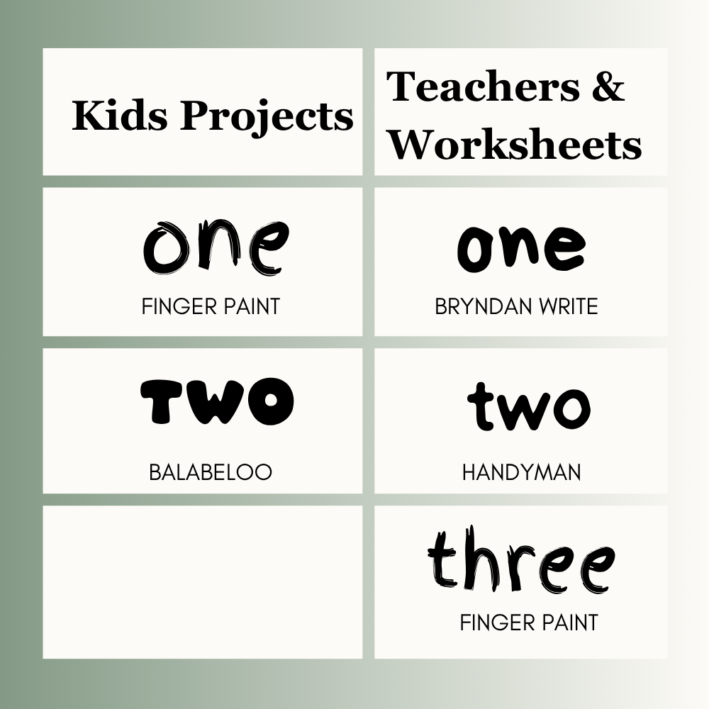
Kids Projects
- Finger Paint
- Balabeloo
- Raily
Teachers & Worksheets
- Bryndan Write
- Handyman
- Finger Paint
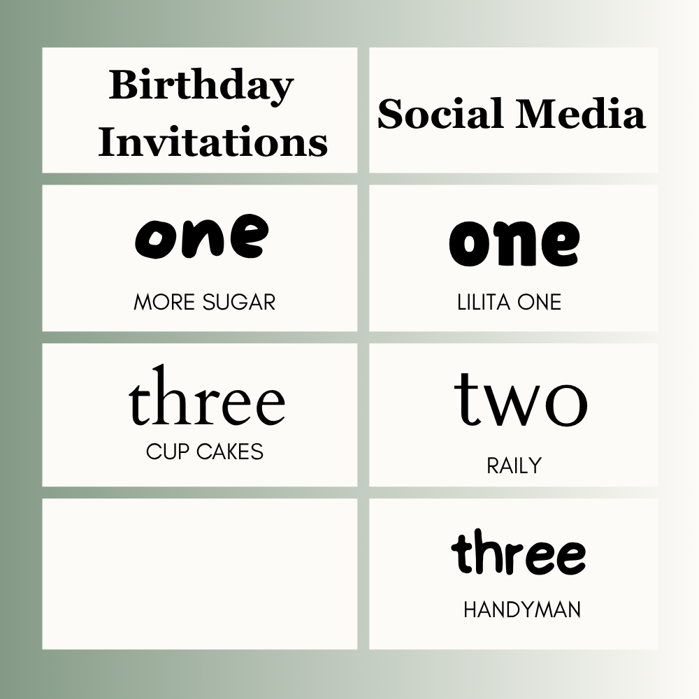
Birthday Invitations
- More Sugar
- Cup Cakes
- Raily
Social Media
- Lilita One
- Raily
- Handyman
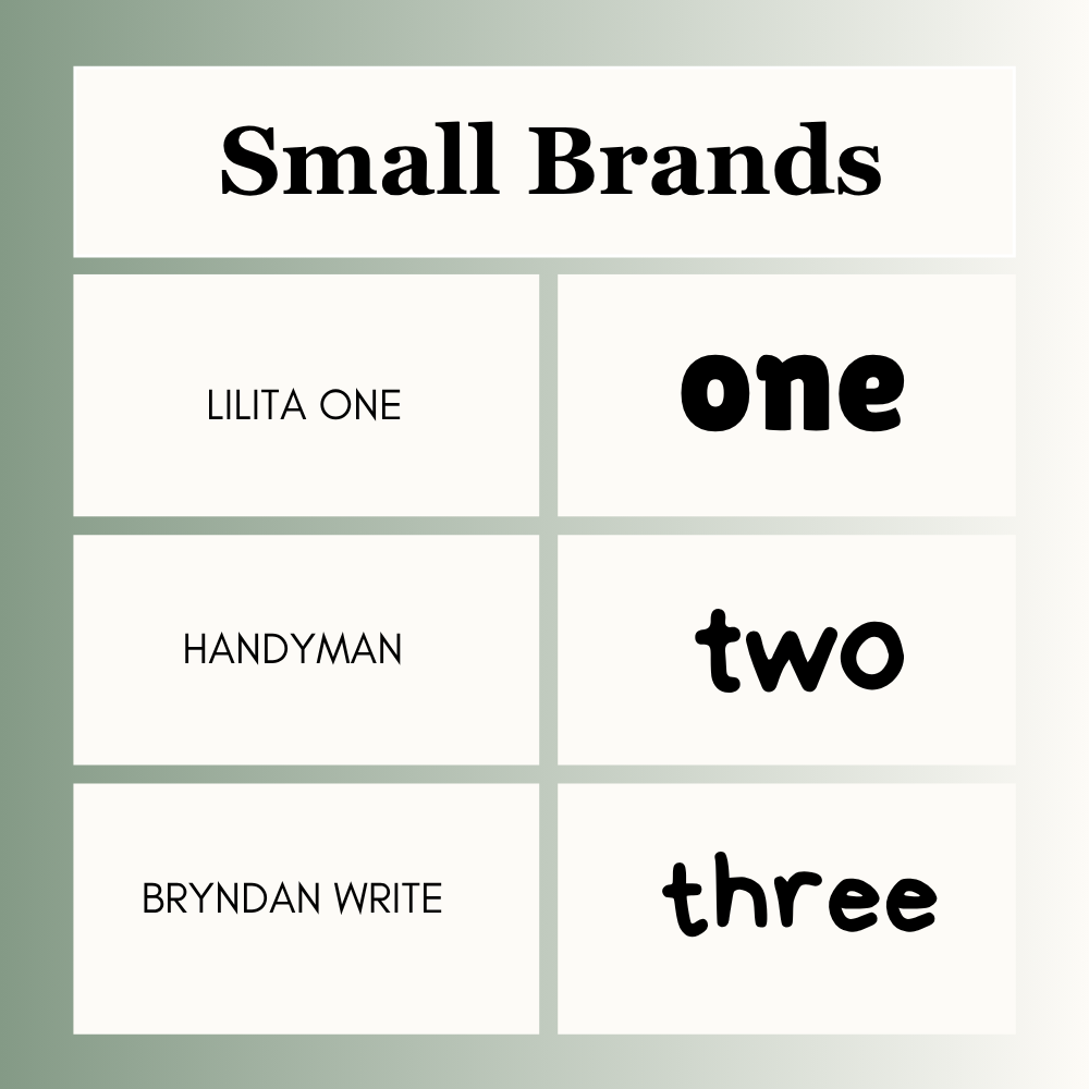
Small Brands
- Lilita One
- Handyman
- Bryndan Write
Free vs Paid Canva Fonts
If you use Canva Free, many fun fonts like Lilita One, Raily, Handyman, More Sugar, Balabeloo, Finger Paint, Bryndan Write, and Cup Cakes are already available.
If you use Canva Pro, you may get extra creative font options depending on your account.
Best Canva Font Pairings
Use one fun font with one simple font.For more combinations, check out these best Canva font pairings for social media, branding, and print designs.
- Lilita One + Open Sans
- More Sugar + Lato
- Handyman + Montserrat
- Bryndan Write + Poppins
This keeps the design fun and balanced.
How to Choose the Right Fun Font
1. Check the Purpose
Worksheet, invite, post, logo, or branding?
2. Think About Audience
Kids need different fonts than business customers.
3. Test Readability
Can people read it quickly?
4. Keep It Simple
Use one fun font and one clean font.
5. Stay Consistent
Use the same style across the design.
Common Mistakes to Avoid
- Using too many fun fonts
- Choosing hard-to-read styles
- Making text too small
- Using playful fonts for serious designs
- Ignoring spacing
- Overloading the design
Frequently Asked Questions
Lilita One, Raily, and Handyman are popular choices.
Finger Paint, Balabeloo, and Raily work well.
More Sugar, Cup Cakes, and Raily are strong options.
Yes. Many free fun fonts work very well.
Use two fonts in most designs. One fun and one simple.
Not always. Free fonts are often enough. Paid fonts may offer more variety.
Final Thoughts
I always choose my fonts based on who is going to look at my design. In my daily work, Lilita One is my first choice for bold social media graphics. For school activities, I go with Finger Paint or Bryndan Write because they look like real handwriting. For cute party cards, More Sugar and Cup Cakes are perfect. If I want a solid but sweet look, I use Handyman.
Good design is all about balance. It should look bright but stay easy to read. Keep your spaces clean, use the same font throughout your project, and do a quick review before sharing it with the world.

I’m Faraz, the founder and lead content strategist at The Vistly. With a background in digital marketing, I lead content and design strategy for the site, working alongside a small team of designers to create practical Canva tutorials, font pairings, and design resources for creators, small businesses, and marketers around the world. My goal with The Vistly is to make professional-quality design accessible to anyone, no design degree required.