Easy to Read Canva Fonts for Presentations, Worksheets, and Posts
Great content means nothing if no one can read it clearly. Cluttered or overly stylish fonts make viewers lose interest within seconds. To fix this, you must focus on clear fonts. A clear design helps you share your message easily. Bold titles stand out, and good spacing makes the text comfortable for the eyes. That is why this guide focuses on easy to read Canva fonts that help real users create clearer and more effective designs.
Quick Answer
The best easy to read Canva fonts are Open Sans, Poppins, Montserrat, Nunito, Lato, Raleway, League Spartan, and Merriweather Sans. These fonts work well for presentations, body text, social media graphics, websites, posters, printables, and professional designs.
What Makes a Font Easy to Read?
A readable font should:
- Use clear letter shapes
- Have good spacing
- Stay sharp on screens
- Print clearly on paper
- Match the design purpose
If people struggle to read the text, the font is not the right choice.
Best Easy to Read Canva Fonts
| Font Name | Best For | Style | Availability |
| Open Sans | Body Text | Clear Neutral | Free |
| Poppins | Slides, Social Media | Clean Modern | Free |
| Montserrat | Headings, Presentations | Professional Bold | Free |
| Nunito | Printables | Rounded Clean | Free |
| Lato | Website Text | Balanced Modern | Free |
| Raleway | Elegant Graphics | Clean Stylish | Free |
| League Spartan | Posters, Titles | Strong Bold | Free |
| Merriweather Sans | Long Reading | Easy Reading | Free |
| Premium Canva Fonts | Unique Styles | Varies | Canva Pro / Paid |
NOTE:Some font availability may depend on your Canva plan, region, account setup, or updates inside the Canva editor.
Best Fonts by Use Case
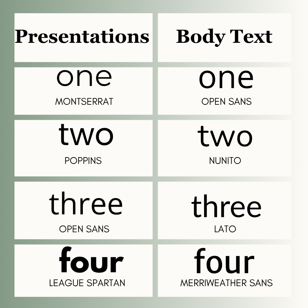
Presentations
- Montserrat
- Poppins
- Open Sans
- League Spartan
Great for slides, classes, meetings, and reports.
Body Text
- Open Sans
- Nunito
- Lato
- Merriweather Sans
Best for blogs, guides, long paragraphs, and websites.
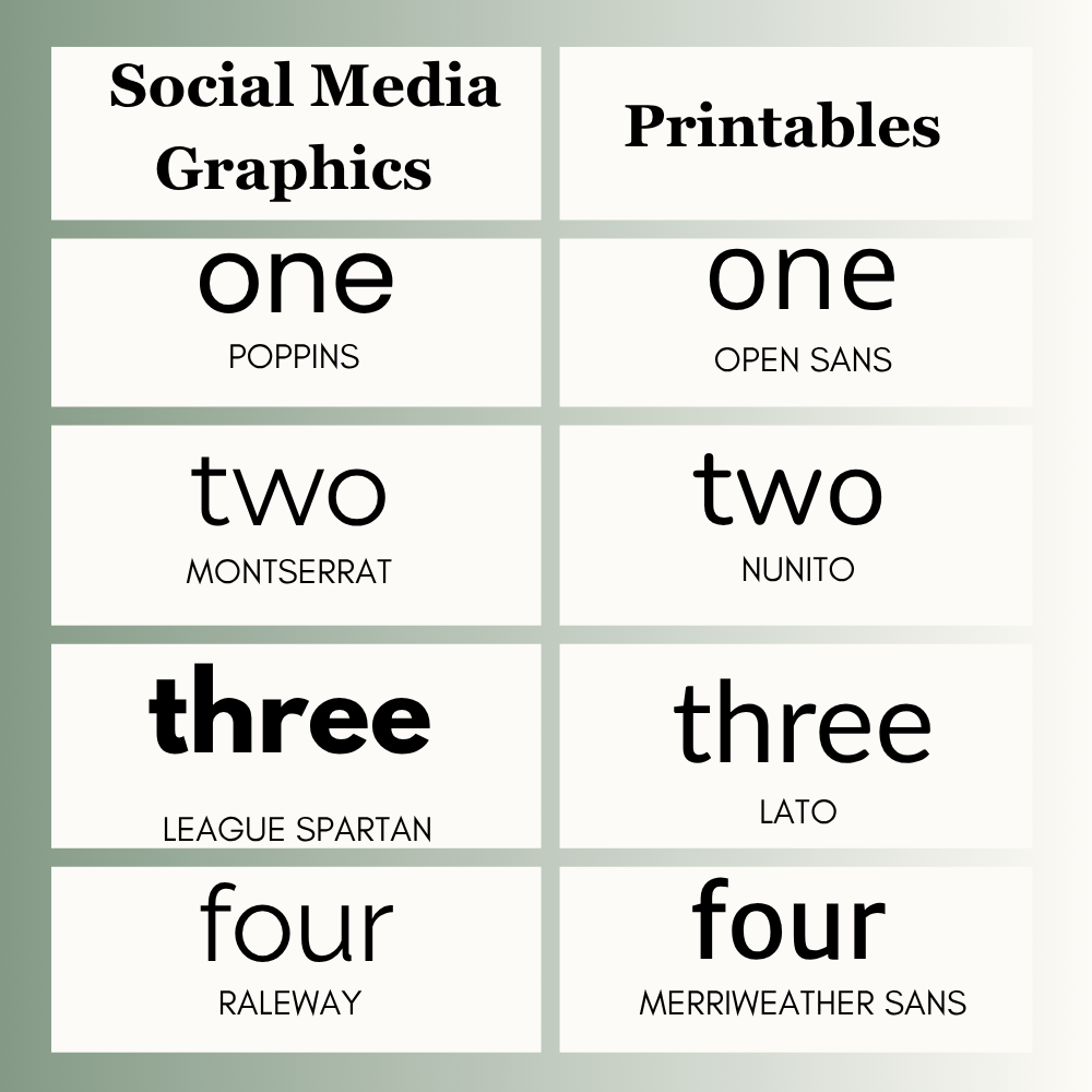
Social Media Graphics
- Poppins
- Montserrat
- League Spartan
- Raleway
Good for mobile-friendly posts and fast attention.
Printables
- Open Sans
- Nunito
- Poppins
- Lato
Useful for worksheets, planners, PDFs, and handouts.
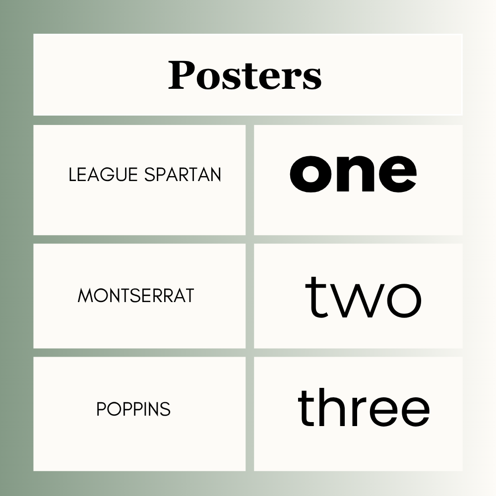
Posters
- League Spartan
- Montserrat
- Poppins
Best for headlines, announcements, and banners.
Free vs Paid Canva Fonts
If you use Canva Free, you already have many strong options such as Open Sans, Poppins, Montserrat, Nunito, Lato, and League Spartan.
If you use Canva Pro, you may get extra fonts and more style options depending on your account.
Best Canva Font Pairings
Use one heading font and one body font.
- Montserrat + Open Sans
- League Spartan + Nunito
- Poppins + Lato
- Raleway + Open Sans
This keeps your design clean and balanced.
How to Choose the Right Readable Font
1. Check the Purpose
Is it for a slide, post, flyer, website, or worksheet?
2. Think About Device
Will users read it on mobile, desktop, or print?
3. Test Readability
Can someone read it in two seconds?
4. Keep It Simple
Use one heading font and one body font.
5. Avoid Decorative Overload
Style should never hurt readability.
Common Mistakes to Avoid
- Using too many fonts
- Choosing hard-to-read styles
- Making text too small
- Ignoring mobile preview
- Ignoring print tests
- Picking style over clarity
Frequently Asked Questions
Open Sans, Poppins, Nunito, and Montserrat are popular choices.
Open Sans, Lato, Nunito, and Merriweather Sans are strong options.
Montserrat, Poppins, Open Sans, and League Spartan work well.
Yes. Many free Canva fonts are excellent for clear designs.
Use two fonts in most designs. One for headings and one for body text.
Not always. Free fonts often perform very well. Paid fonts may offer more variety.
Final Thoughts
The best easy to read Canva fonts depend on your project, and who will see it. For body text, I usually choose Open Sans or Nunito. They work well for projects. For presentations and headings, Montserrat and Poppins are options. If you need a font for a poster, League Spartan is a good choice.
I have learned that good designs are the ones people can understand fast. If users can’t read the message, the design isn’t effective. When choosing a font, think about readability first. Test the font on the right screen size or print size. Keep the spacing clean. Use the same font throughout.
Expert Tip
Try the “3-Second Squint Test”
Before you finish any design, step back and close your eyes halfway. If your text blurs or becomes hard to read, change the font immediately. Your audience will only look at your graphic for 3 seconds. Instead of chasing a “fancy” look, stick to a strong pair like Montserrat for titles and Open Sans for body text. Give your words some empty space to breathe, because a clean design always wins.
Still looking for the right font? Don’t miss these guides:
- Best Canva Fonts for Posters
- Best Sans Serif Fonts on Canva
- Best Canva Font Pairings
- Best Canva Fonts for Headings

I’m Faraz, the founder and lead content strategist at The Vistly. With a background in digital marketing, I lead content and design strategy for the site, working alongside a small team of designers to create practical Canva tutorials, font pairings, and design resources for creators, small businesses, and marketers around the world. My goal with The Vistly is to make professional-quality design accessible to anyone, no design degree required.