Best Canva Fonts for Headings (Free & Paid Picks That Actually Work)
Ever noticed how a design can have the perfect layout and great colors, but the moment you add the main title, the whole thing just looks dull? If you’re making blog covers, social media graphics, or digital products for Etsy, you’ve probably spent way too much time scrolling through Canva’s font list, changing the title fifty times, and still feeling like it’s not hitting right.
The problem isn’t that you need a rare or fancy font. It’s just that your title isn’t strong enough to stand out on the page. A weak title makes your whole project look unfinished. You don’t need to waste hours testing every single font in the sidebar. You just need a few dependable choices that look professional every time. Let’s look at these fonts so you can finish your work faster and stop guessing.
Quick Answer
The best Canva fonts for headings are Montserrat, League Spartan, Anton, Bebas Neue, Playfair Display, Cinzel, Poppins, and Abril Fatface. These fonts work well because they are clear, eye-catching, and flexible for titles, covers, thumbnails, presentations, and branding.
If you want to explore more Canva font ideas, check out these related guides:
- Best Sans Serif Fonts on Canva
- Best Serif Fonts on Canva
- Best Canva Font Pairings (Free Combinations That Actually Work)
- Best Script Fonts on Canva: A Simple Guide to Better Looking Designs
What Makes a Good Heading Font?
A strong heading font should do these three things:
- Grab attention quickly
- Stay easy to read
- Match the design style
If a font looks stylish but feels hard to read, it is not the best choice for headings.
Best Canva Fonts for Headings
| Font Name | Best For | Style | Availability |
| Montserrat | Business, Blogs, Social Media | Clean Modern | Free |
| League Spartan | Bold Titles, Thumbnails | Strong Sans Serif | Free |
| Anton | YouTube, Posters, Ads | Heavy Bold | Free |
| Bebas Neue | Headlines, Sales Graphics | Tall Bold | Free |
| Playfair Display | Fashion, Beauty, Luxury | Elegant Serif | Free |
| Cinzel | Wedding, Premium Brands | Classic Elegant | Free |
| Poppins | Startups, Branding, Web Graphics | Friendly Clean | Free |
| Abril Fatface | Pinterest Covers, Creative Posts | Stylish Bold | Free |
| Cormorant Garamond | Elegant Branding, Invitations | Premium Serif | Free / Varies |
| DM Serif Display | Editorial, Luxury Titles | Stylish Serif | Free / Varies |
NOTE:Some font availability may depend on your Canva plan, region, account setup, or updates inside the Canva editor.
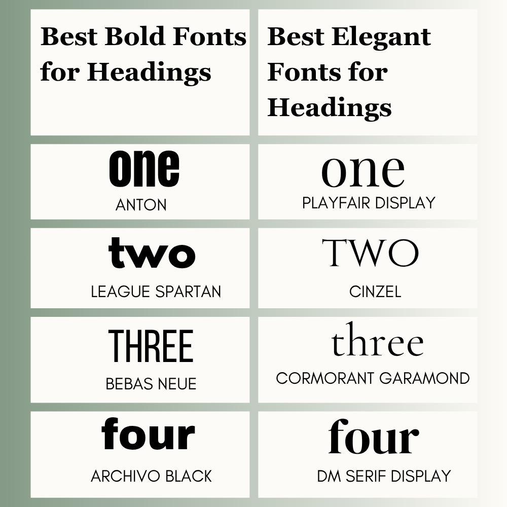
Best Bold Fonts for Headings
If you need attention fast, use bold fonts. These are useful for YouTube thumbnails, sale banners, event posters, and social media graphics.
- Anton
- League Spartan
- Bebas Neue
- Archivo Black
Bold fonts usually perform better on mobile because they stay clear at smaller sizes.
Best Elegant Fonts for Headings
Elegant fonts work well when you want a premium or stylish look. These are great for beauty brands, wedding invites, fashion posts, and luxury businesses.
- Playfair Display
- Cinzel
- Cormorant Garamond
- DM Serif Display
Use extra spacing and clean layouts with elegant fonts for better results.
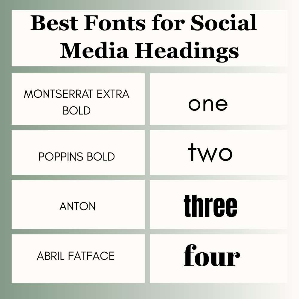
Best Fonts for Social Media Headings
Social media users scroll fast. Your title needs to stand out in seconds.
Best picks:
- Montserrat Extra Bold
- Poppins Bold
- Anton
- Abril Fatface
These fonts look strong on Instagram posts, Facebook graphics, and promotional creatives.
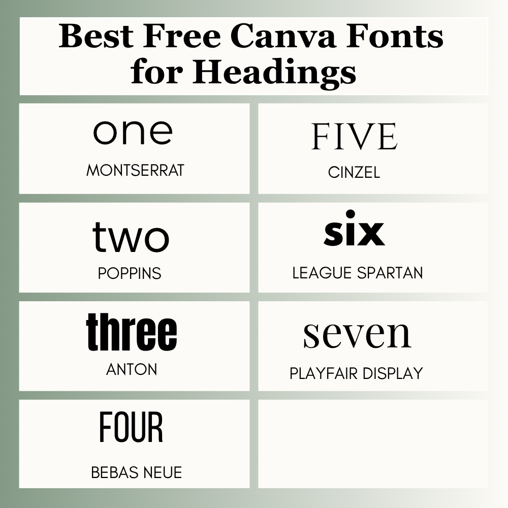
Best Free Canva Fonts for Headings
If you use Canva Free, you still have many great options.
Top free picks:
- Montserrat
- Poppins
- Anton
- Bebas Neue
- Playfair Display
- Cinzel
- League Spartan
You do not need Canva Pro to create strong headings.
Best Canva Fonts by Use Case
For YouTube Thumbnails
Use bold fonts that are readable in small preview sizes.
- Anton
- Bebas Neue
- League Spartan
For Pinterest Pins
Pinterest titles should be clear and attractive.
- Abril Fatface
- Montserrat
- Playfair Display
- Poppins Bold
For Presentations
Choose clean and professional fonts.
- Montserrat
- Raleway
- Poppins
- Lato
For Blog Titles
Use fonts that feel strong and readable.
- Playfair Display
- Montserrat
- Libre Baskerville
- Cinzel
For Logos
Your font should match the brand personality.
- Poppins
- League Spartan
- Cinzel
- Bebas Neue
Best Canva Font Pairings
The easiest formula is one strong heading font + one simple body font.
- Montserrat + Lato
- Playfair Display + Open Sans
- Anton + Poppins
- Cinzel + Raleway
- League Spartan + Nunito Sans
This keeps your design clean and professional.
How to Choose the Right Heading Font
Use this quick method.
1. Know Your Goal
Do you want bold, elegant, modern, playful, or professional?
2. Know Your Audience
A bakery brand needs a different style than a law office.
3. Check Readability
Can users read it in two seconds?
4. Test on Mobile
Always preview your design on phone size.
5. Keep It Simple
Use one heading font and one body font in most designs.
Common Mistakes to Avoid
Many Canva users make these simple mistakes:
- Using too many fonts
- Choosing hard-to-read styles
- Making headings too thin
- Ignoring mobile preview
- Using decorative fonts for serious brands
- Picking style over clarity
Avoiding these mistakes can improve your design fast.
Frequently Asked Questions
There is no single best font for every design. Popular choices include Montserrat, Anton, League Spartan, Playfair Display, and Poppins.
Many strong free options include Montserrat, Poppins, Anton, Bebas Neue, Playfair Display, Cinzel, and League Spartan.
Bold fonts like Anton, Bebas Neue, and League Spartan work well because they stay readable quickly.
Use two fonts in most cases. One for headings and one for body text.
Not always. Many free Canva fonts perform just as well. Paid fonts can offer more variety or unique styles.
Final Thoughts
The best Canva font for headings depends on your goal, audience, and design style. If you want a clean business look, Montserrat or Poppins are safe choices. If you need bold attention, Anton or League Spartan work well. If you want elegance, Playfair Display or Cinzel can instantly improve the feel of your design.
From real design experience, the best results usually come from keeping things simple. Choose one strong heading font, pair it with a clean body font, and preview your design before publishing. Trends change, but readability and clarity continue to win. The more you practice, the faster you will know which font fits your design.
Expert Tip
After testing fonts across blog covers, ads, client graphics, and Pinterest content, I have found that simple fonts often win more than trendy fonts. Clear headings usually perform better than overly creative ones. If you are unsure, start with Montserrat, Poppins, or Playfair Display.

I’m Faraz, the founder and lead content strategist at The Vistly. With a background in digital marketing, I lead content and design strategy for the site, working alongside a small team of designers to create practical Canva tutorials, font pairings, and design resources for creators, small businesses, and marketers around the world. My goal with The Vistly is to make professional-quality design accessible to anyone, no design degree required.