Best Retro Font Pairings on Canva (Free Combos That Actually Work)
Canva gives us access to thousands of beautiful typefaces, but having too many choices can paralyze your creative process. You log in intending to finish a quick merch graphic or an Etsy listing, and suddenly you’ve spent two hours scrolling through a massive dropdown menu, falling into a typography rabbit hole. If you are tired of the endless scrolling, in this guide, we have curated the Best Retro Font Pairings on Canva. These ready-to-use duos are built to give your brand an instant, professional throwback aesthetic so you can stop testing fonts and start publishing content.
Quick Answer
The best retro font pairings on Canva are Monoton + Glacial Indifference, Broadway + Glass Antiqua, Tan Nimbus + Garet, Druzhba Retro + Sansterdam Condensed, Retropix + Courier Prime, Bebas Neue + Open Sans, Coiny + League Spartan, Pacifico + Montserrat, Anton + DM Sans, and Righteous + Poppins. These combinations work well for posters, logos, t-shirts, social media graphics, party flyers, and vintage branding because they balance personality with readability.
If you’re exploring more Canva typography styles, these related guides can help you find retro fonts, pairings, and design ideas for different projects:
- Retro Fonts on Canva (Best Free & Paid Picks for Vintage Designs) — for more individual retro font options.
- Best Canva Font Pairings (Free Combinations That Actually Work) — for more font combinations beyond retro styles.
- 25 Best 70s Fonts on Canva (Free, Groovy & Easy Picks for 2026) — for groovy typography inspired by the 1970s.
- 90s Fonts on Canva (Best Free & Paid Picks for Nostalgic Designs) — for nostalgic typography with a 90s feel.
- Vintage Fonts on Canva (Best Free & Paid Picks for Timeless Designs) — for classic vintage styles that work well with retro designs.
What Makes a Good Retro Font Pairing?
A strong retro pairing should do these things:
- Create nostalgia or vintage mood
- Stay easy to read
- Match the design theme
- Work well on mobile and desktop
- Use one strong font and one support font
The easiest formula is:
- Retro display font for headings
- Clean font for body text or details
If both fonts are too decorative, the design often feels crowded.
Best Retro Font Pairings on Canva
| Font Pairing | Best For | Style | Why It Works |
| Monoton + Glacial Indifference | Posters, Events | 80s Neon | Bold headline with clean support |
| Broadway + Glass Antiqua | Logos, Flyers | Vintage Glam | Strong retro personality |
| Tan Nimbus + Garet | Branding | Modern Retro | Stylish and readable |
| Druzhba Retro + Sansterdam Condensed | T-Shirts | 70s Groovy | Fun nostalgic vibe |
| Retropix + Courier Prime | Gaming Graphics | Arcade Retro | Pixel style with clarity |
| Bebas Neue + Open Sans | Posters | Vintage Modern | Strong readable combo |
| Coiny + League Spartan | Social Media | Playful Retro | Friendly and bold |
| Pacifico + Montserrat | Cafés, Packaging | Warm Vintage | Casual and clean |
| Anton + DM Sans | Promotions | Bold Retro | Great for marketing graphics |
| Righteous + Poppins | Logos | Rounded Retro | Balanced modern nostalgia |
| Archivo Black + Lora | Ads | Heavy Editorial | Strong contrast |
| Cinzel + Poppins | Premium Retro | Classic Modern | Elegant authority |
| Bungee + Open Sans | Flyers | Loud Vintage | Attention grabbing |
| Permanent Marker + Montserrat | Event Graphics | Casual Retro | Fun personality |
| Teko + DM Sans | Posters | Condensed Retro | Great space control |
Some fonts may vary based on Canva account type, region, or future updates.
Best Retro Font Pairings by Use Case
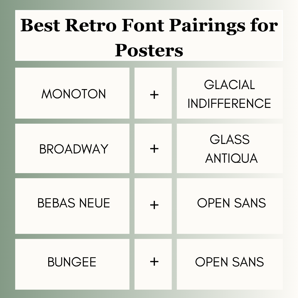
Best Retro Font Pairings for Posters
Posters need fast attention and strong mood.
Best picks:
- Monoton + Glacial Indifference
- Broadway + Glass Antiqua
- Bebas Neue + Open Sans
- Bungee + Open Sans
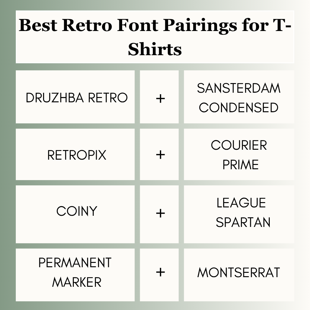
Best Retro Font Pairings for T-Shirts
Shirt designs need bold personality.
Best picks:
- Druzhba Retro + Sansterdam Condensed
- Retropix + Courier Prime
- Coiny + League Spartan
- Permanent Marker + Montserrat
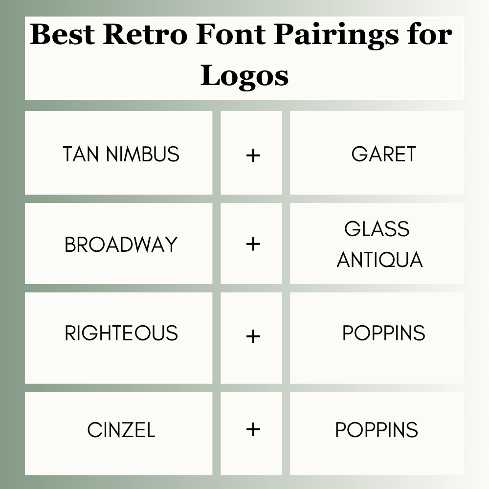
Best Retro Font Pairings for Logos
Logos should feel memorable and clean.
Best picks:
- Tan Nimbus + Garet
- Broadway + Glass Antiqua
- Righteous + Poppins
- Cinzel + Poppins
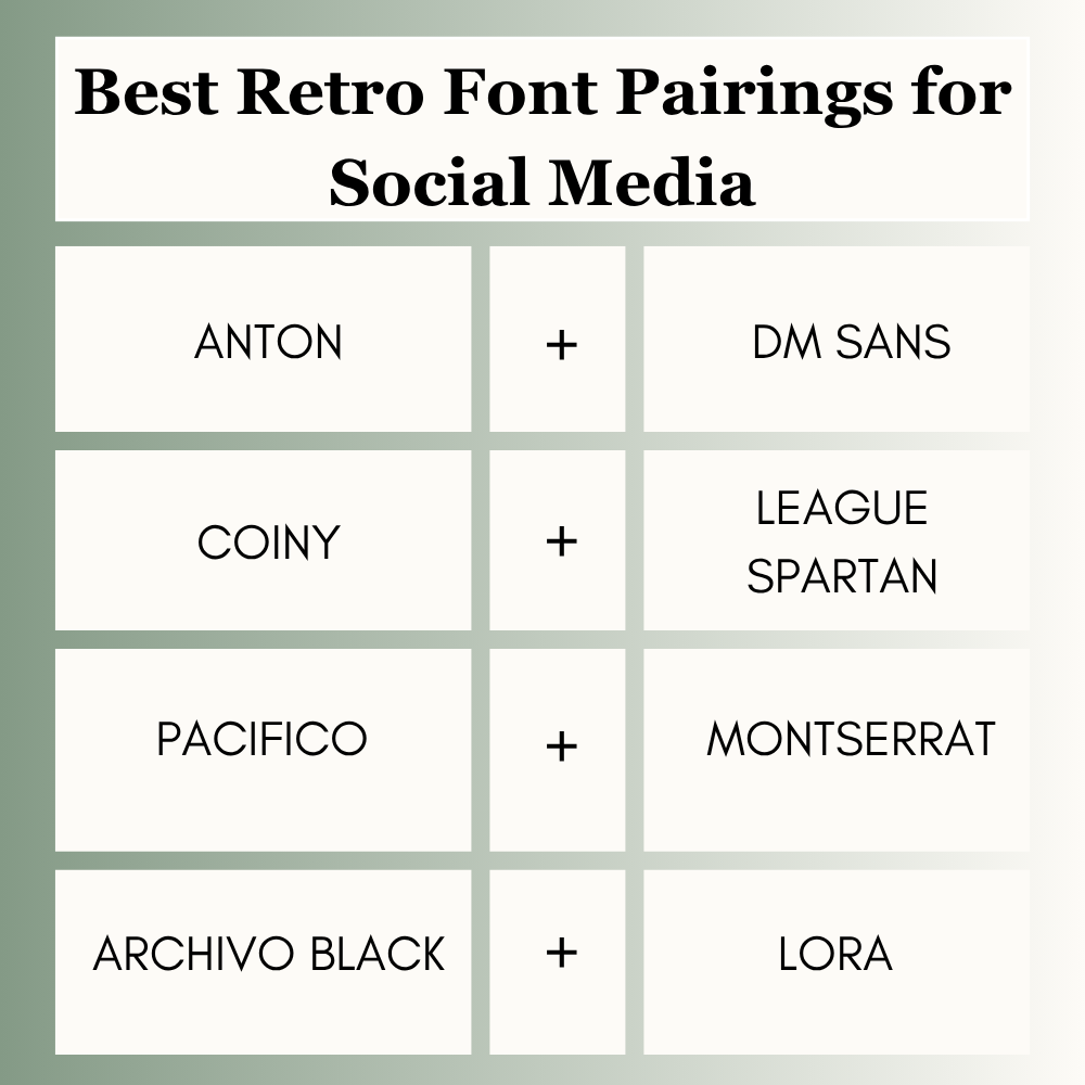
Best Retro Font Pairings for Social Media
Users scroll fast, so readability matters.
Best picks:
- Anton + DM Sans
- Coiny + League Spartan
- Pacifico + Montserrat
- Archivo Black + Lora
Best Free Retro Font Pairings on Canva
You do not need Canva Pro to create strong retro designs.
Top free options:
- Monoton + Glacial Indifference
- Bebas Neue + Open Sans
- Anton + DM Sans
- Coiny + League Spartan
- Pacifico + Montserrat
- Righteous + Poppins
Always double-check font availability in your account.
How to Choose the Right Retro Pairing
Use this quick method:
1. Pick an Era
Do you want 70s groovy, 80s neon, vintage diner, or arcade style?
2. Choose One Hero Font
Your headline font should carry the retro vibe.
3. Add a Clean Support Font
Use a simple font for prices, details, or body text.
4. Test on Mobile
A cool font that cannot be read is a weak choice.
5. Keep It Consistent
Use the same pairing across related designs.
Common Mistakes to Avoid
Many users make these simple mistakes:
- Using two decorative retro fonts together
- Choosing unreadable neon fonts for small text
- Ignoring spacing
- Making headings too small
- Using too many colors with busy fonts
- Changing pairings every design
Avoiding these mistakes often improves results immediately.
Frequently Asked Questions
Monoton + Glacial Indifference is one of the best all-round retro Canva pairings.
Broadway + Glass Antiqua works well for strong vintage poster style.
Druzhba Retro + Sansterdam Condensed is a strong groovy option.
Use two fonts in most cases. One for headings and one for support text.
Yes. Many free Canva combinations work extremely well when used correctly.
Final Thoughts
When you’re short on time, stop experimenting and rely on pairs that are proven to work across posters, logos, and merch graphics. You can never go wrong with these three reliable Canva duos:
- Bright paired with Glacial Indifference (for a warm, retro-modern look)
- Retrosans paired with Barlow (for a bold, old-school athletic vibe)
- Playfair Display paired with Aileron (for a timeless, classic nostalgic aesthetic)
Expert Tip
After testing retro typography across posters, shirts, ads, and social graphics, I have found that bold retro heading + simple support font performs better than two flashy fonts together. If you are unsure where to start, choose Monoton + Glacial Indifference or Anton + DM Sans. Clear designs usually outperform complicated ones.

I’m Faraz, the founder and lead content strategist at The Vistly. With a background in digital marketing, I lead content and design strategy for the site, working alongside a small team of designers to create practical Canva tutorials, font pairings, and design resources for creators, small businesses, and marketers around the world. My goal with The Vistly is to make professional-quality design accessible to anyone, no design degree required.