
How to Create a Gradient in Canva
Blending two or more colors together to make a smooth background seems like it should be simple. But once you open the editor, finding the right tools can feel like a giant guessing game. Many users end up sticking with plain, solid colors instead of learning how to create a gradient in Canva quickly.
But after making tons of graphics, one thing is completely clear: color matters. Mixing colors smoothly adds depth and guides people’s eyes to your text in just a few seconds. This guide will show you how to create a gradient in Canva the fastest way, fix easy layout mistakes, and instantly upgrade your visual designs.
Quick Answer
To create a gradient in Canva, use gradient elements, built-in gradient tools, or editable color blends. Add the gradient to your design, choose your colors, adjust placement, and save the final result. This is the fastest way to make gradient backgrounds, text effects, overlays, and modern graphics in Canva.
If you want to explore more Canva design techniques, these related guides may help:
- How to Remove Background in Canva (Fast & Easy Guide for 2026)
- Best Canva Font Pairings (Free Combinations That Actually Work)
- Best Aesthetic Canva Font Combinations (Free Pairings That Actually Work)
- How to Add Drop Shadow in Canva (Fast & Easy Guide for 2026)
Best Ways to Create a Gradient in Canva
| Method | Best For | Difficulty | Why It Works |
| Built-in Gradient | Fast Custom Colors | Easy | Best overall |
| Gradient Elements | Quick Backgrounds | Easy | Beginner friendly |
| Gradient Text | Headlines | Medium | Premium look |
| Transparent Gradient | Overlays | Medium | Better readability |
| Mobile Gradient Method | Phone Users | Easy | Quick edits |
What a Gradient Means in Canva
A gradient is a smooth blend between two or more colors.
Popular Examples:
- Blue to purple background
- Pink to orange social post
- Black transparent overlay
- Gold premium banner
- Soft pastel blend
Gradients help designs feel more modern and dynamic.
How to Create a Gradient in Canva on Desktop
This is the easiest method for most users.
Step 1: Open Your Design
Create a new project or open an existing one.
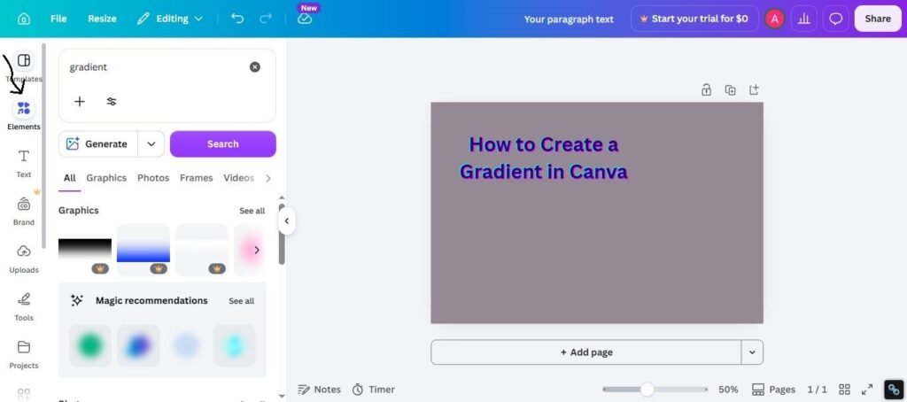
Step 2: Search for Gradient
Go to Elements and search for gradient.
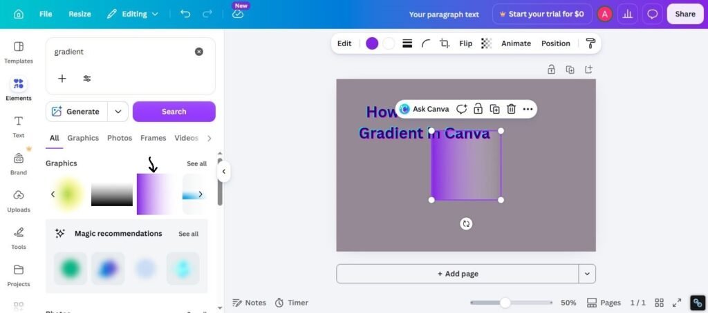
Step 3: Choose a Gradient Style
Pick a background, shape, or editable gradient.
Step 4: Change Colors
Customize colors if the selected gradient allows editing.
Step 5: Resize and Position
Stretch it to cover the background or place it where needed.
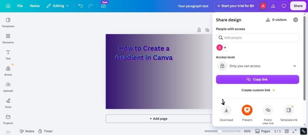
Step 6: Save the Design
Preview and export your final design.
How to Make a Gradient Background in Canva
This is the most common use case.
Best For:
- Social media posts
- Website banners
- YouTube thumbnails
- Ads
- Presentations
Smart Tips:
- Use 2 to 3 colors max
- Keep contrast balanced
- Avoid neon overload
- Match your brand colors
Subtle gradients usually look more premium than loud ones.
How to Create Gradient Text in Canva
Great for headlines and attention-grabbing designs.
Best For:
- Titles
- Logos
- Promo graphics
- Event posters
- Thumbnails
Quick Method:
- Use gradient text tools or workarounds
- Apply brand colors
- Keep text bold and readable
- Test contrast against background
Short bold words often work best.
How to Make a Transparent Gradient in Canva
Useful when text sits on top of images. If you also need to create transparent areas in your design, see our guide on how to make a background transparent in Canva
Best For:
- Hero banners
- Product promos
- Quote posts
- Website headers
- Video thumbnails
Quick Method:
- Add transparent gradient overlay
- Place over image
- Add text above it
- Adjust visibility
This can improve readability instantly.
Best Color Gradient Ideas
Use these combinations for better results.
Professional
- Blue + Navy
- Black + Gray
- Green + Teal
Creative
- Purple + Pink
- Orange + Red
- Cyan + Violet
Soft / Elegant
- Beige + White
- Light Pink + Peach
- Sky Blue + White
Common Problems and Fixes
Gradient Looks Cheap
Try:
- Use softer tones
- Reduce color count
- Improve spacing
Text Hard to Read
Try:
- Add transparent dark overlay
- Increase font weight
- Improve contrast
Colors Clash
Try:
- Use similar shades
- Follow brand palette
- Simplify choices
Gradient Not Editable
Try:
- Choose another element
- Use editable gradient option
- Search new styles
How to Make Canva Gradients Look Better
Use these practical tips:
1. Keep It Clean
Simple gradients often win.
2. Use White Space
Do not crowd the design.
3. Guide Attention
Use brighter areas near CTA or headline.
4. Stay On Brand
Use your business colors where possible.
5. Test on Mobile
Colors can feel different on small screens.
Expert Tip
After testing Canva gradients for client branding, thumbnails, ads, and landing pages, I have found that beginners often use colors that are too strong. They think louder means better. In real projects, softer gradients with clear typography usually perform better and look more expensive.
If you are unsure where to start, use:
- 2 colors only
- Good contrast
- Clean headline
- Plenty of spacing
- Final mobile preview
That workflow works in many real projects.
Frequently Asked Questions
Search for gradient elements or use available gradient tools, then customize colors and placement.
Yes. Canva supports gradient text methods depending on current tools and workflows.
Use gradient overlays with transparency and place them over images.
Yes. When used well, gradients can make branding feel modern and premium.
Usually because of poor color choices, weak contrast, or too many effects.
Final Thoughts
Learning how to create a gradient in Canva is an easy secret for better graphics. It gives your files a high-quality look and stops your background from being just a plain, boring sheet of one color. It is a fantastic trick for social media posts, brand logos, or any creative digital products you are sharing online.
From real experience, you get the best results when you don’t overcomplicate things. Stick to soft transitions between your colors, keep your spacing balanced, and always look over your work to test it before sharing. Fancy styles always change, but keeping your facts clear and beautiful never goes out of fashion.

I’m Faraz, the founder and lead content strategist at The Vistly. With a background in digital marketing, I lead content and design strategy for the site, working alongside a small team of designers to create practical Canva tutorials, font pairings, and design resources for creators, small businesses, and marketers around the world. My goal with The Vistly is to make professional-quality design accessible to anyone, no design degree required.