Best Aesthetic Canva Font Combinations (Free Pairings That Actually Work)
The secret to standardizing your brand identity isn’t hidden inside complex software it’s actually sitting right inside your editor’s text menu. While most creators obsess over perfect color hex codes or complex layouts, true visual authority comes down to how your headlines talk to your body text. In this guide, we are bypassing the trial-and-error phase entirely to look at the Best Aesthetic Canva Font Combinations that immediately establish trust, elevate your layouts, and make your digital footprint look entirely intentional.
Quick Answer
The best aesthetic Canva font combinations are Playfair Display + Poppins, Cormorant Garamond + Lato, Quiche + Montserrat, Raleway + Merriweather, Pacifico + Quicksand, Cinzel + DM Sans, Great Vibes + Open Sans, League Spartan + Lora, Abril Fatface + Poppins, and Tan Mon Cheri + Montserrat. These combinations work well for branding, Instagram posts, websites, beauty businesses, Pinterest graphics, invitations, and marketing because they balance style with readability. If you’re exploring more Canva typography, these related guides are worth checking out:
- Best Serif Fonts on Canva
- Best Sans Serif Fonts on Canva
- Best Canva Font Pairings (Free Combinations That Actually Work)
- Best Cursive Fonts on Canva (2026): Elegant Script Fonts for Logos, Weddings, and Social Media
What Makes a Font Combination Aesthetic?
A strong aesthetic pairing should do these things:
- Look stylish and balanced
- Stay easy to read
- Match the brand mood
- Work on mobile and desktop
- Use one hero font and one support font
The easiest formula is:
- Statement font for headings
- Clean font for body text
If both fonts fight for attention, the design usually feels cluttered.
Best Aesthetic Canva Font Combinations
| Font Pairing | Best For | Style | Why It Works |
| Playfair Display + Poppins | Branding, Websites | Elegant Modern | Premium contrast with clean support |
| Cormorant Garamond + Lato | Beauty Brands | Soft Luxury | Stylish and readable |
| Quiche + Montserrat | Feminine Designs | Romantic Elegant | Beautiful headline balance |
| Raleway + Merriweather | Blogs | Clean Editorial | Great readability |
| Pacifico + Quicksand | Lifestyle Brands | Fun Aesthetic | Friendly personality |
| Cinzel + DM Sans | Premium Brands | Classic Modern | Strong authority feel |
| Great Vibes + Open Sans | Invitations | Elegant Script | Stylish and balanced |
| League Spartan + Lora | Business Brands | Professional Aesthetic | Clean and trustworthy |
| Abril Fatface + Poppins | Fashion Brands | Luxury Bold | High-end impact |
| Tan Mon Cheri + Montserrat | Boutique Branding | Soft Premium | Elegant modern mix |
| Bebas Neue + Open Sans | Promotions | Bold Clean | Strong attention grabber |
| DM Sans + Playfair Display | Websites | Minimal Elegant | Great user experience |
| Cormorant + Poppins | Editorial Brands | Refined Modern | Beautiful contrast |
| Spectral + Lato | Content Brands | Smart Editorial | Easy reading flow |
| Anton + Montserrat | Social Media | Bold Stylish | Fast readability |
NOTE:Some fonts may vary depending on Canva plan, region, or future updates.
Best Aesthetic Font Pairings by Use Case
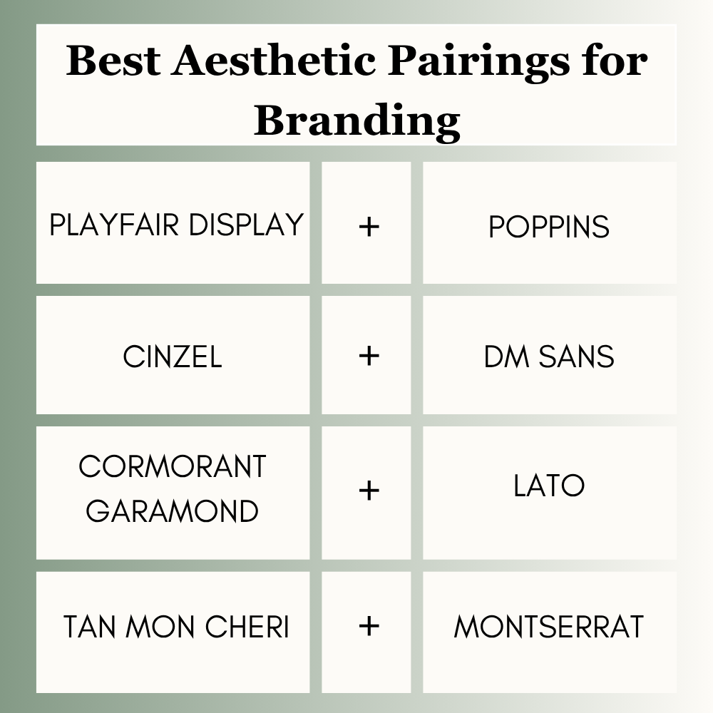
Best Aesthetic Pairings for Branding
Brands need identity and consistency.
Best picks:
- Playfair Display + Poppins
- Cinzel + DM Sans
- Cormorant Garamond + Lato
- Tan Mon Cheri + Montserrat
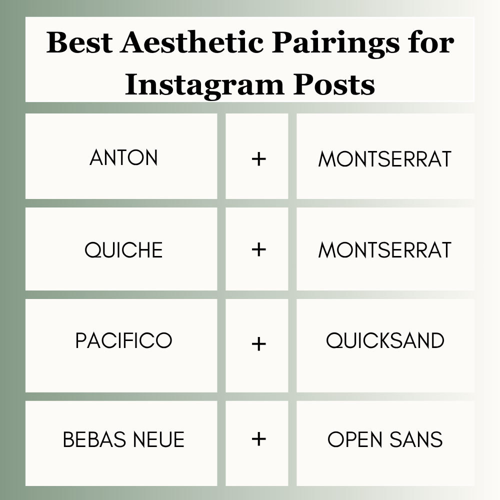
Best Aesthetic Pairings for Instagram Posts
Fast scrolling means readability matters.
Best picks:
- Anton + Montserrat
- Quiche + Montserrat
- Pacifico + Quicksand
- Bebas Neue + Open Sans
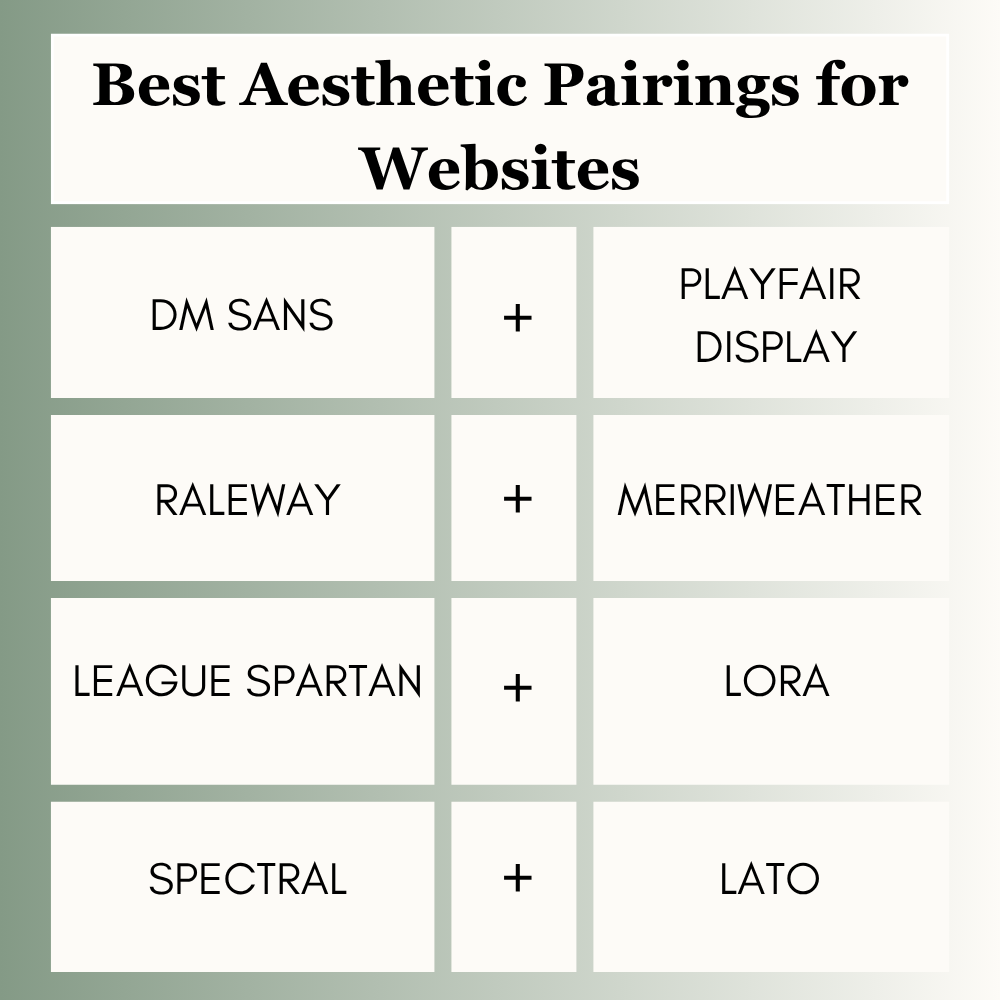
Best Aesthetic Pairings for Websites
Websites need readability first.
Best picks:
- DM Sans + Playfair Display
- Raleway + Merriweather
- League Spartan + Lora
- Spectral + Lato
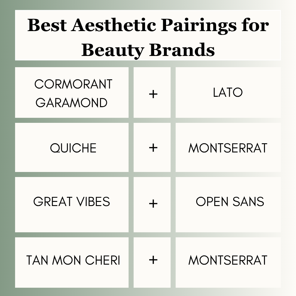
Best Aesthetic Pairings for Beauty Brands
Beauty brands need soft premium style.
Best picks:
- Cormorant Garamond + Lato
- Quiche + Montserrat
- Great Vibes + Open Sans
- Tan Mon Cheri + Montserrat
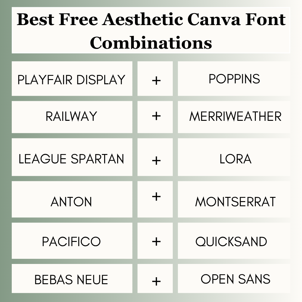
Best Free Aesthetic Canva Font Combinations
You do not need Canva Pro to design beautifully. If you’re wondering whether Canva Free is enough or if upgrading is worth it, our Canva Free vs Pro comparison can help you decide.
Top free options:
- Playfair Display + Poppins
- Raleway + Merriweather
- League Spartan + Lora
- Anton + Montserrat
- Pacifico + Quicksand
- Bebas Neue + Open Sans
Always check font availability inside your Canva account.
How to Choose the Right Aesthetic Pairing
Use this quick method:
1. Know Your Goal
Instagram post, website, logo, ad, invitation, or brand kit?
2. Know Your Audience
A skincare brand needs a different pairing than a tech startup.
3. Pick One Main Personality Font
Let one font carry the style.
4. Add a Clean Support Font
This keeps the design readable.
5. Test on Mobile
Beautiful fonts can fail on smaller screens.
Common Mistakes to Avoid
Many users make these simple mistakes:
- Using two decorative fonts together
- Choosing thin fonts for mobile
- Ignoring spacing
- Using too many font styles
- Changing pairings every design
- Sacrificing readability for style
Avoiding these mistakes often improves designs immediately.
Frequently Asked Questions
Playfair Display + Poppins is one of the strongest all-round choices.
Quiche + Montserrat works well for soft elegant branding.
Raleway + Merriweather is a strong free-friendly option.
Use two fonts in most cases. Three can work, but two is safer.
Not always. Many free combinations perform just as well when used correctly.
Final Thoughts
The right combination gives your layout immediate direction. You can establish a classic, premium authority using Playfair Display + Poppins, or embrace a softer, luxurious minimalism with Cormorant Garamond + Lato. If your aesthetic is chic and gracefully feminine, Quiche + Montserrat is a reliable staple, whereas Anton + Montserrat creates the sharp, stopping power needed for fast-paced social feeds. Skip the overcomplicated layouts choose one definitive anchor font, align it with a highly readable partner, and stick to it.
Expert Tip
After testing typography across client brands, Instagram posts, websites, and ad creatives, I have found that stylish heading + clean support text wins more often than two fancy fonts together. If you are unsure where to start, choose Playfair Display + Poppins or Cormorant Garamond + Lato. Clear beautiful designs usually outperform complicated ones.

I’m Faraz, the founder and lead content strategist at The Vistly. With a background in digital marketing, I lead content and design strategy for the site, working alongside a small team of designers to create practical Canva tutorials, font pairings, and design resources for creators, small businesses, and marketers around the world. My goal with The Vistly is to make professional-quality design accessible to anyone, no design degree required.