Best Canva Font Pairings (Free Combinations That Actually Work)
You don’t need a design degree to create visuals that demand attention you just need a shortcut to the combinations that actually work in the real world. Instead of forcing you to memorize typography rules or stare at blank canvas templates, we have curated a masterlist of the best Canva font pairings built for speed and visual impact. In this guide, you’ll find exact font duos that bring immediate clarity and style to your content, making your workflow faster than ever.
Quick Answer
The best Canva font pairings are Playfair Display + Poppins, Anton + DM Sans, Great Vibes + Montserrat, League Spartan + Lora, Pacifico + Quicksand, Bebas Neue + Open Sans, Abril Fatface + Montserrat, Raleway + Merriweather, Cinzel + Poppins, and Oswald + Lato. These combinations work well for branding, Instagram posts, websites, presentations, invitations, and marketing graphics because they balance style with readability. If you’re exploring more Canva typography, these related guides are worth checking out:
- Best Serif Fonts on Canva
- Best Sans Serif Fonts on Canva
- Best Handwriting Fonts in Canva
- Retro Fonts on Canva (Best Free & Paid Picks for Vintage Designs)
- Best Aesthetic Canva Font Combinations (Free Pairings That Actually Work)
What Makes a Good Font Pairing?
A strong font pairing should do these things:
- Create contrast without clashing
- Stay easy to read
- Match the design mood
- Work well on mobile and desktop
- Keep the layout balanced
A common formula is:
- One strong heading font
- One clean body font
If both fonts fight for attention, the design usually feels messy.
Best Canva Font Pairings
| Font Pairing | Best For | Style | Why It Works |
| Playfair Display + Poppins | Branding, Websites | Elegant Modern | Strong contrast and premium feel |
| Anton + DM Sans | Social Media, Ads | Bold Clean | High readability and impact |
| Great Vibes + Montserrat | Invitations | Romantic Elegant | Stylish and balanced |
| League Spartan + Lora | Business Brands | Professional | Trustworthy and clean |
| Pacifico + Quicksand | Fun Brands | Playful Friendly | Warm personality |
| Bebas Neue + Open Sans | Posters | Bold Modern | Strong headline support |
| Abril Fatface + Montserrat | Fashion Brands | Luxury Modern | High-end visual style |
| Raleway + Merriweather | Blogs | Editorial Clean | Great reading experience |
| Cinzel + Poppins | Premium Branding | Classic Modern | Elegant authority |
| Oswald + Lato | Marketing Graphics | Clean Bold | Easy to scan |
| Cormorant + DM Sans | Beauty Brands | Elegant Soft | Stylish contrast |
| Archivo Black + Open Sans | Promotions | Heavy Bold | Great conversion focus |
| Lobster + Montserrat | Food Brands | Friendly Script | Fun but readable |
| Teko + Poppins | Flyers | Condensed Modern | Space-saving impact |
| Quiche + League Spartan | Luxury Invites | Premium Romantic | Strong visual identity |
NOTE:Some font availability may depend on your Canva plan, region, account type, or updates inside the Canva editor.
Best Canva Font Pairings by Use Case
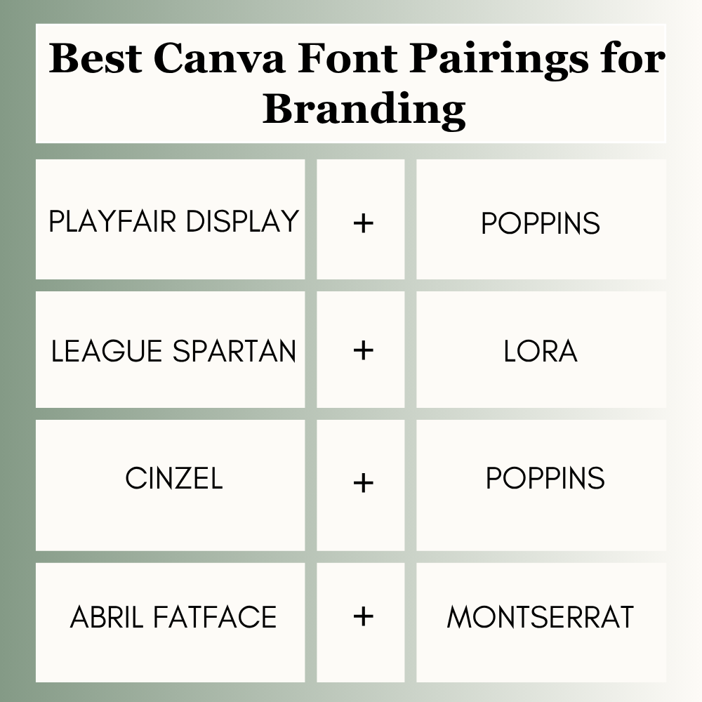
Best Canva Font Pairings for Branding
Brands need trust and consistency. The right pairing can also make a logo feel more professional, so choosing the right Canva fonts for logos is important.
Best picks:
- Playfair Display + Poppins
- League Spartan + Lora
- Cinzel + Poppins
- Abril Fatface + Montserrat
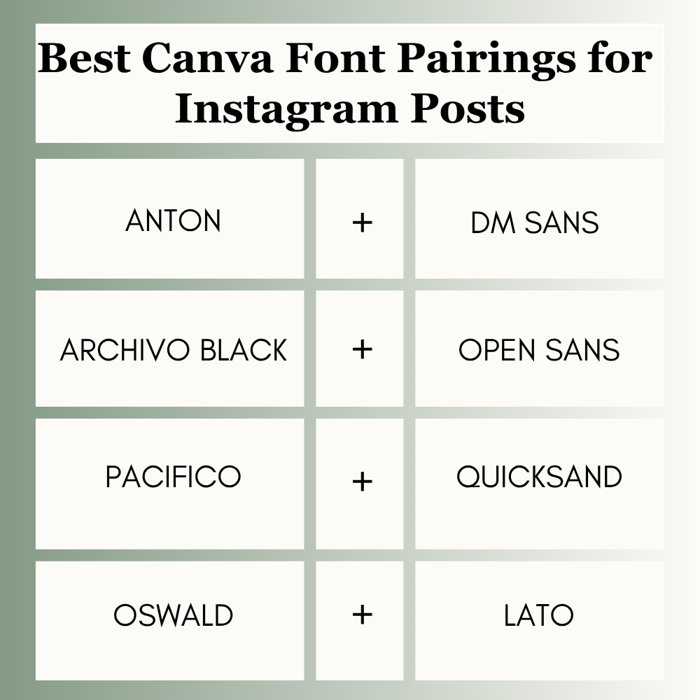
Best Canva Font Pairings for Instagram Posts
Social users scroll fast, so clarity matters.
Best picks:
- Anton + DM Sans
- Archivo Black + Open Sans
- Pacifico + Quicksand
- Oswald + Lato
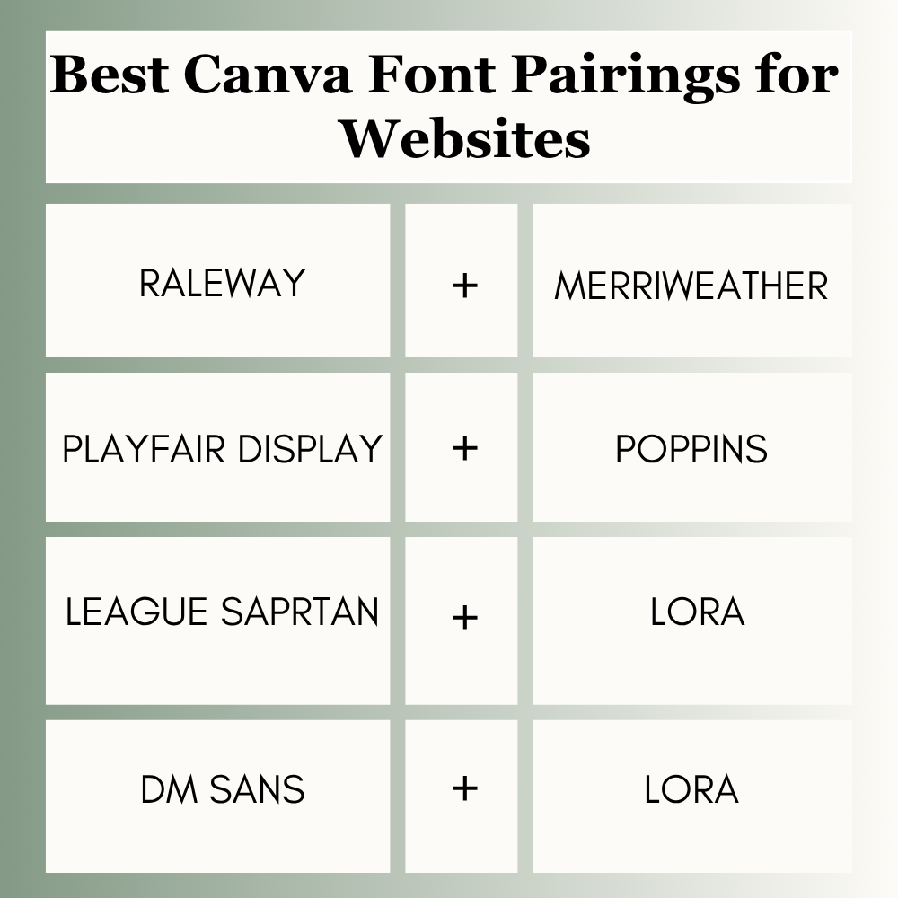
Best Canva Font Pairings for Websites
Websites need readability first.
Best picks:
- Raleway + Merriweather
- Playfair Display + Poppins
- League Spartan + Lora
- DM Sans + Lora
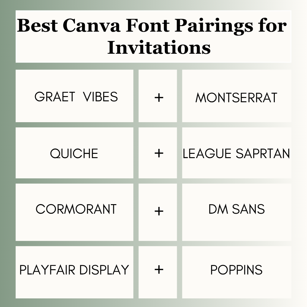
Best Canva Font Pairings for Invitations
Invites should feel stylish and memorable.
Best picks:
- Great Vibes + Montserrat
- Quiche + League Spartan
- Cormorant + DM Sans
- Playfair Display + Poppins
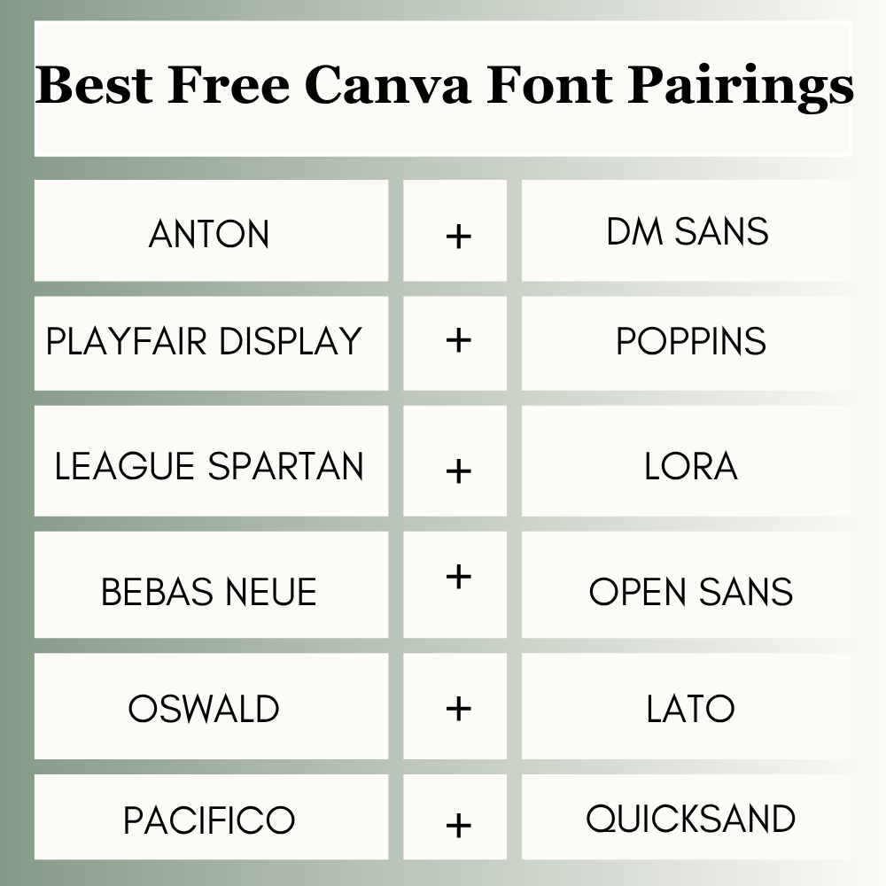
Best Free Canva Font Pairings
If you use Canva Free, you still have many strong options.
Top free picks:
- Anton + DM Sans
- Playfair Display + Poppins
- League Spartan + Lora
- Bebas Neue + Open Sans
- Oswald + Lato
- Pacifico + Quicksand
You do not need Canva Pro to create professional typography.
Canva Font Pairing Rules for Beginners
Use this quick method:
1. Mix Personality + Simplicity
Use one stylish font and one clean font.
2. Avoid Similar Fonts
Two fonts that look almost the same can feel boring.
3. Check Weight Contrast
Use bold heading + lighter support text.
4. Test on Mobile
Always preview your design on phone size.
5. Keep It Consistent
Use the same pairing across brand assets.
Common Mistakes to Avoid
Many Canva users make these simple mistakes:
- Using too many fonts
- Pairing two decorative fonts
- Choosing thin fonts for mobile graphics
- Ignoring spacing
- Using script fonts for paragraphs
- Changing pairings on every design
Avoiding these mistakes can improve your designs quickly.
Frequently Asked Questions
Playfair Display + Poppins is one of the best all-round Canva font pairings.
League Spartan + Lora works well for professional and trustworthy brands.
Anton + DM Sans is strong because it stays readable quickly.
Use two fonts in most cases. Sometimes three can work, but two is safer.
Not always. Many free Canva combinations perform just as well.
Final Thoughts
Font choice changes the entire mood of your design. For a luxury or high-end look, pair Playfair Display with Poppins. If you want bold, high-converting marketing graphics, Anton and DM Sans work best. Great Vibes with Montserrat nails elegant invitations, while Pacifico and Quicksand add a fun, friendly spark to creative projects.
The golden rule here is simplicity. Lock in one strong header font, anchor it with a clean supporting font, and stay consistent. Readable text always beats passing design trends.
Expert Tip
After testing font combinations across client graphics, ads, logos, and content assets, I have found that bold heading + clean support text usually wins more than fancy combinations. If you are unsure, start with Playfair Display + Poppins or Anton + DM Sans. Clear designs usually perform better than overdesigned ones.

I’m Faraz, the founder and lead content strategist at The Vistly. With a background in digital marketing, I lead content and design strategy for the site, working alongside a small team of designers to create practical Canva tutorials, font pairings, and design resources for creators, small businesses, and marketers around the world. My goal with The Vistly is to make professional-quality design accessible to anyone, no design degree required.