Elegant Fonts in Canva (Best Free & Paid Picks for Premium Designs)
Picking the right font in Canva can be hard. You want your design to look expensive and beautiful, but many fonts look either too plain or hard to read. If you are making a logo, an Instagram post, or an Etsy product banner, the wrong font can make your hard work look less professional.
Good fonts change everything. They make people trust your brand and love your style. In this guide, we will show you the best clean and elegant Canva fonts that make your designs look high-quality in just a few seconds.
Quick Answer
The best elegant fonts in Canva are Playfair Display, Lora, Prata, Cormorant Garamond, Libre Baskerville, Cardo, Antic Didone, Abril, and Tenor Sans. These fonts work well for logos, branding, invitations, websites, beauty graphics, Etsy products, and premium social media designs.
If you want to explore more Canva font ideas, these related guides may help:
- Best Serif Fonts on Canva
- Best Aesthetic Canva Fonts (2026): Stylish Fonts for Beautiful Designs, Branding, and Social Media
- Best Serif and Sans Serif Pairings (Elegant Combos That Actually Work)
What Makes a Font Elegant?
A strong elegant font should:
- Look refined and stylish
- Stay easy to read
- Have balanced spacing
- Fit premium designs
- Build trust quickly
If a font feels messy or childish, it is not the right choice.
Best Elegant Fonts in Canva
| Font Name | Best For | Style | Availability |
| Playfair Display | Invitations, Branding | Elegant Serif | Free |
| Lora | Websites, Editorial | Refined Serif | Free |
| Prata | Logos, Luxury Graphics | Premium Serif | Free |
| Cormorant Garamond | Fashion Brands | Luxury Classic | Free |
| Libre Baskerville | Print Designs | Traditional Elegant | Free |
| Cardo | Long Text, Websites | Classic Serif | Free |
| Antic Didone | Headlines | Stylish Serif | Free |
| Abril | Feminine Branding | Bold Elegant | Free |
| Tenor Sans | Modern Elegant Content | Clean Stylish | Free |
| Premium Canva Fonts | Unique Styles | Varies | Canva Pro / Paid |
NOTE:Some font availability may depend on your Canva plan, region, account setup, or updates inside the Canva editor.
Best Fonts by Use Case
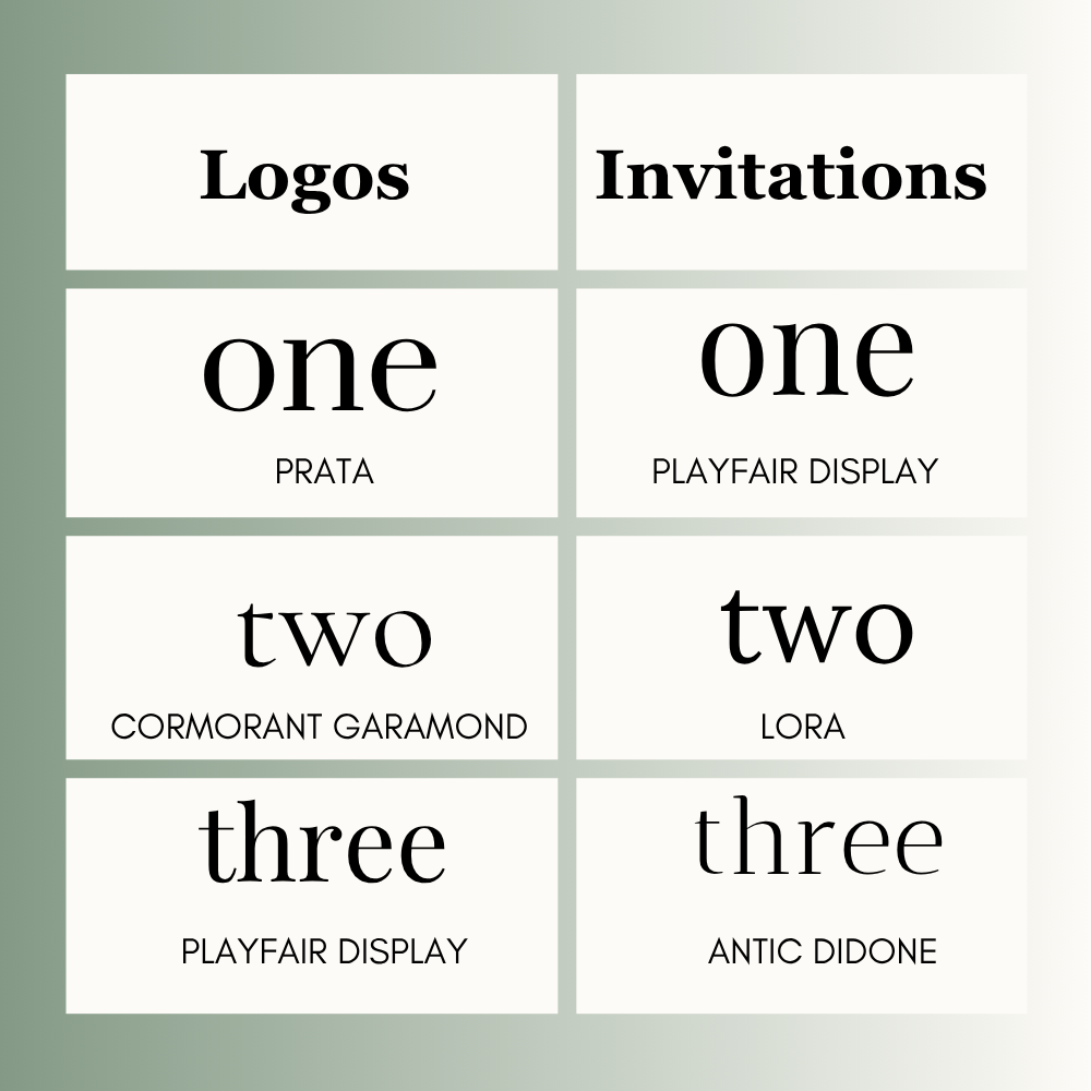
Logos
- Prata
- Cormorant Garamond
- Playfair Display
Invitations
- Playfair Display
- Lora
- Antic Didone
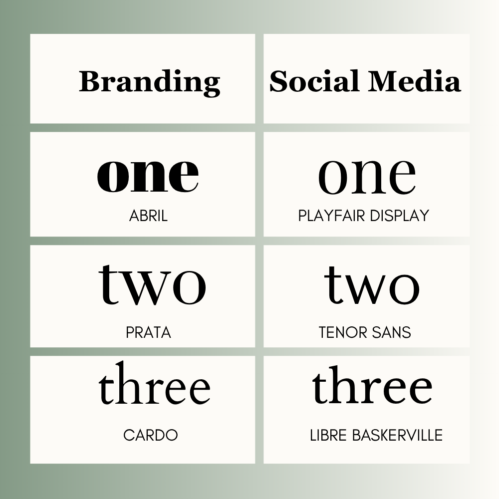
Branding
- Abril
- Prata
- Cardo
Social Media
- Playfair Display
- Tenor Sans
- Libre Baskerville
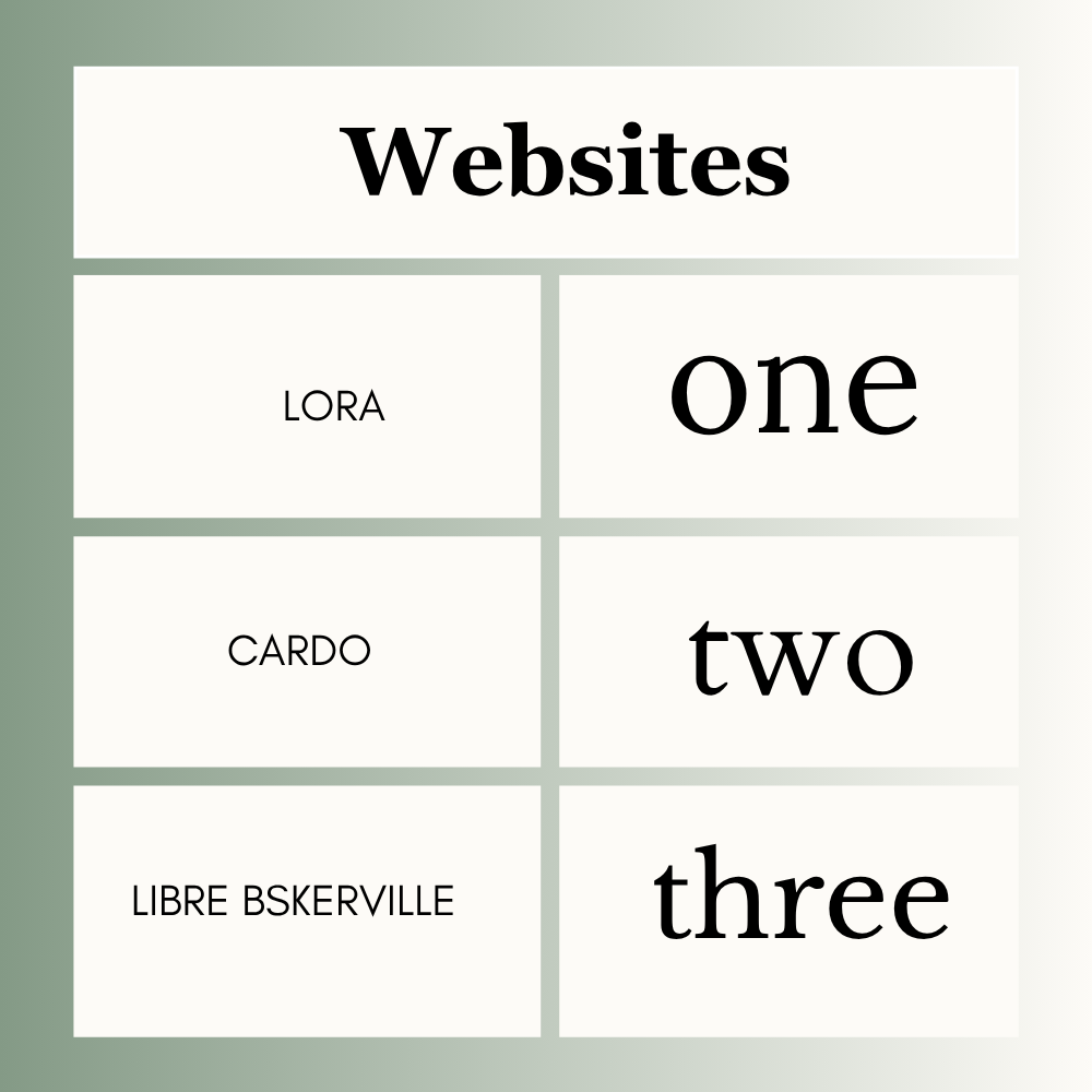
Websites
- Lora
- Cardo
- Libre Baskerville
Free vs Paid Canva Fonts
If you use Canva Free, you already have many strong options such as Playfair Display, Lora, Prata, Libre Baskerville, and Abril.
If you use Canva Pro, you may get extra fonts and more style options depending on your account.
Best Canva Font Pairings
Use one heading font and one body font.
- Playfair Display + Open Sans
- Prata + Lato
- Lora + Poppins
- Cormorant Garamond + Open Sans
This keeps the design polished and balanced.
How to Choose the Right Elegant Font
1. Check the Purpose
Logo, invitation, website, post, or branding?
2. Think About Audience
Luxury buyers need a different feel than casual users.
3. Test Readability
Can people read it quickly?
4. Keep It Simple
Use one heading font and one body font.
5. Stay Consistent
Use the same style across the design.
Common Mistakes to Avoid
- Using too many fonts
- Choosing hard-to-read styles
- Making text too small
- Using elegant fonts everywhere
- Ignoring spacing
- Picking style over clarity
Frequently Asked Questions
Playfair Display, Lora, and Prata are popular choices.
Prata, Cormorant Garamond, and Antic Didone look luxurious.
Playfair Display, Lora, and Antic Didone work well.
Yes. Many free Canva fonts work very well for premium designs.
Use two fonts in most designs. One for headings and one for body text.
Not always. Free fonts often perform very well. Paid fonts may offer more variety.
Final Thoughts
Here are a few great fonts to try in Canva: Use Playfair Display or Lora for elegant cards and clean branding. Pick Prata or Cormorant Garamond for strong logos and big headlines. If you want a softer, elegant look, try Abril.
Good design is always easy to read. To get a professional look, stick to just a couple of fonts, keep the spacing clean, and always review your layout before you send, print, or post it.

I’m Faraz, the founder and lead content strategist at The Vistly. With a background in digital marketing, I lead content and design strategy for the site, working alongside a small team of designers to create practical Canva tutorials, font pairings, and design resources for creators, small businesses, and marketers around the world. My goal with The Vistly is to make professional-quality design accessible to anyone, no design degree required.